UX Design Case Study
Feature design for dental practice management software from the summer of 2023. I was the UX designer on a cross-functional team that completed this project over the course of 12 weeks.

The problem
Users lose track of what other appointments the patient has during the booking flow.
The goal
Allowing the user to view all of the patient’s other appointments; reducing context switching during appointment management flows
The user
A front office worker for a dentist, orthodontist, or oral surgeon; Typically some type of patient-facing front desk worker who would manage appointments for patients
The solution
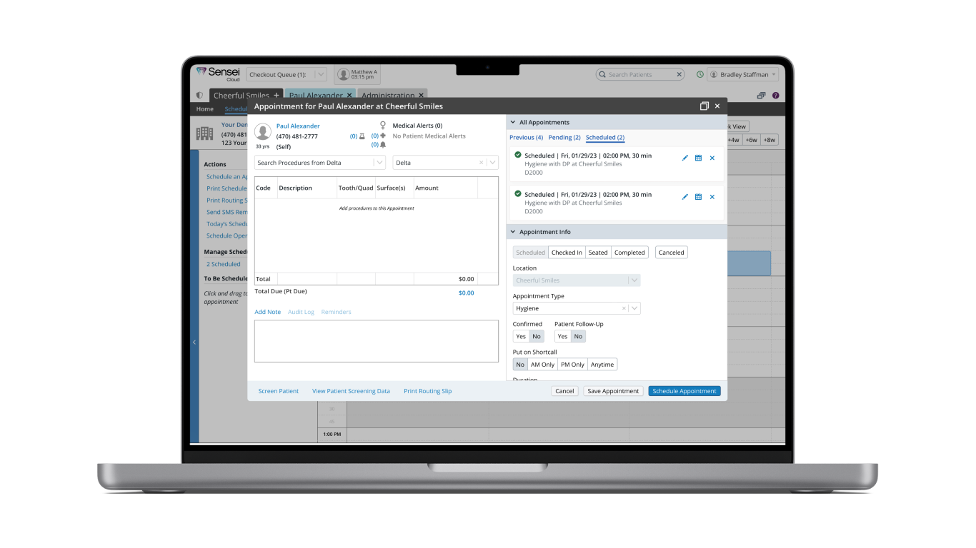
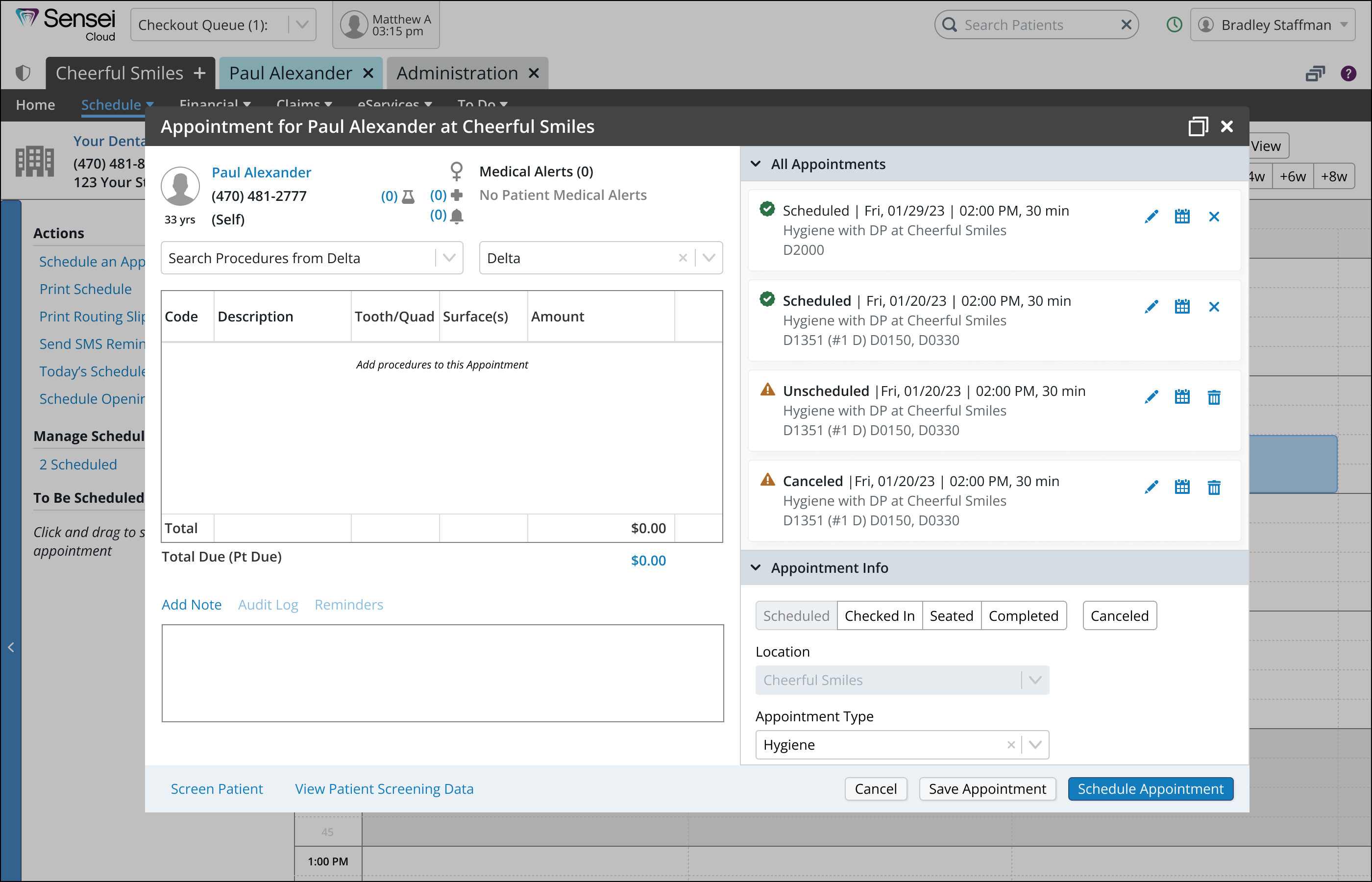
Adding an All Appointments section to the Appointment modal dialogue, allowing the user to clearly see the scheduled and pending appointments for that patient
Researching to find out why
One of the frequent user requests we received was the desire for an alert system when scheduling appointments for patients who already have existing appointments. The product owner highlighted this need during a meeting where we discussed various user requests. Subsequently, I was tasked with conducting research to devise a solution. I created a research plan and interview script, and then proceeded to lead interviews with 9 users who had specifically requested this feature.
Here is what we wanted to learn:
- During the scheduling process, do users want to be notified if a patient has other appointments?
- At what point in the process?
- What type of notification?
- For what type of appointment?
- What type of practice do they work at?
- Why do they want this feature?
- How would they use this feature?
Defining the problem
Participants strongly supported the need for an alert when scheduling a patient with an existing appointment to prevent accidental double bookings, calendar blockages, confusion, and skewed production estimates. An appointment notification could facilitate combining appointments for improved practice efficiency. Moreover, a lack of awareness about a patient's future appointments was potentially reflecting poorly on staff.
Quote
“Even when I remember to look in advace, by the time I'm creating a new appointment, I've forgotten what other appointments the patient has coming up.” - Samanth, user
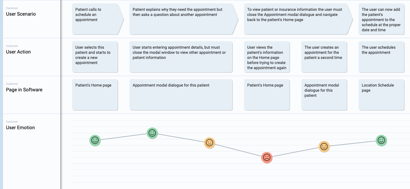
I found that users were abandoning the flow of creating a new appointment because they needed to go back to the patient’s Home page to view other information. I created this user journey map to highlight the frustrations experienced in the booking flow:
Here are my key findings:
- 100% want to be able to view existing appointments for a patient when scheduling, rescheduling, or deleting appointments.
- 100% want a link to edit the appointments that were being viewed.
- 88% want to see planned procedure codes associated with appointments.
- 66% want to see appointments on the pending list in addition to scheduled appointments.
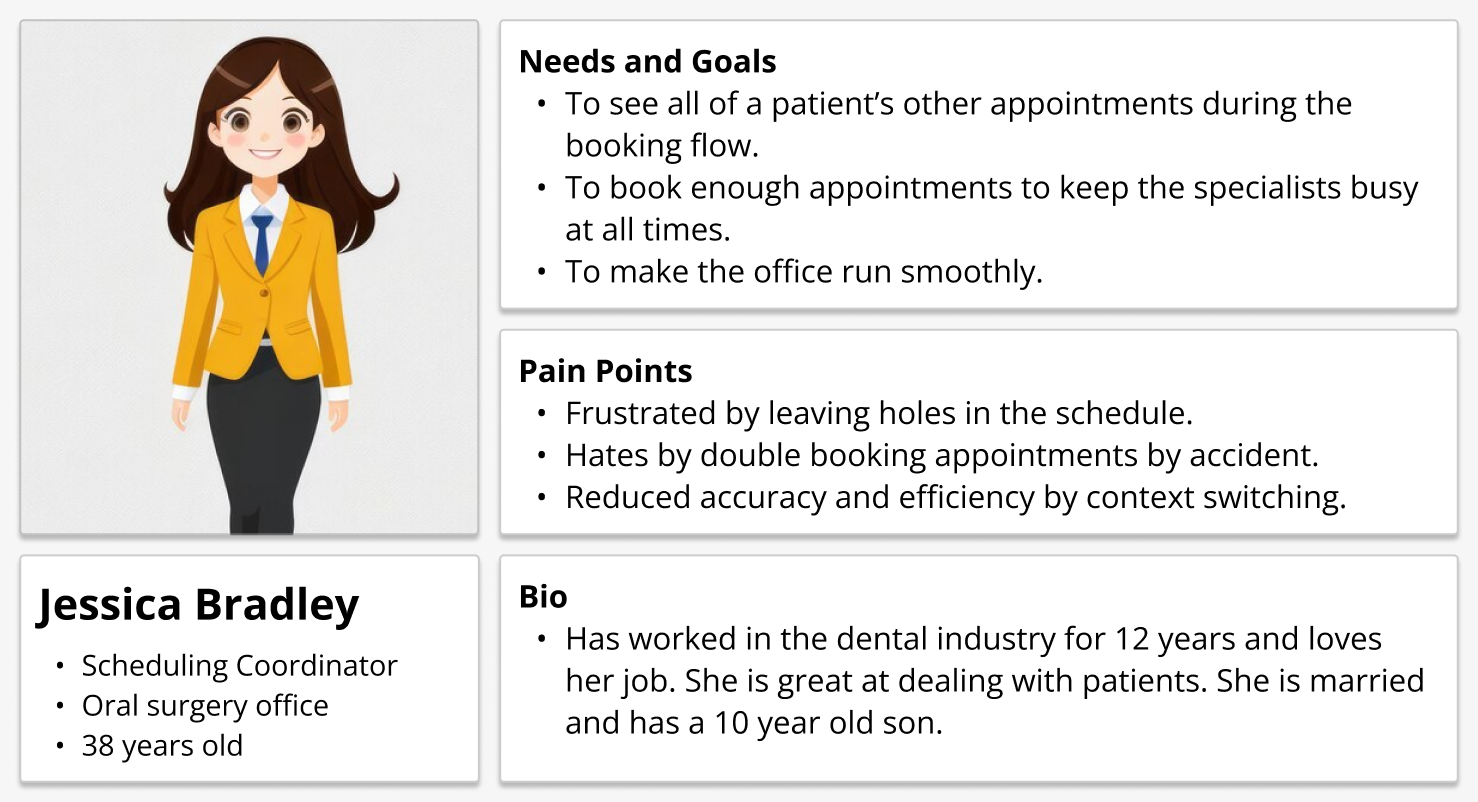
Based on the data that I collected in my research, I created this user persona to help us empathize with the user:
Finding a solution
After conducting my research, I suggested the implementation of a notification system to our product team. This system would manifest as a modal dialogue, serving as an interstitial page guiding users to the relevant Appointment modal. It's important to note that this proposed modification would introduce an additional step in the user flow.

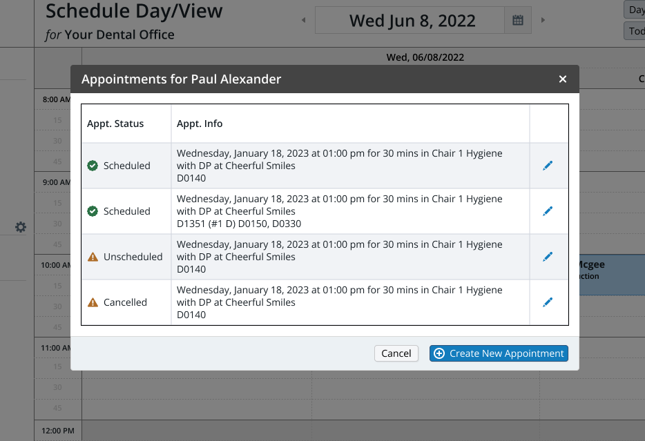
It's worth considering the implementation of notifications for rescheduling and canceling appointments as well. These notifications would showcase the patient's upcoming appointment status, date, time, and the associated planned procedure codes. It's important to note that the planned procedure codes were identified as a top priority by the majority of participants. Additionally, users would have the option to take an edit action using the pencil icon, enabling them to exit the current flow and edit the appointment of their choice. Here are some of the sketches that I made to explore this idea:

Building a prototype
Using Figma, I created mockups for all of the screens so that I could have a working prototype to experience the flows. Here is the modal used in the booking flow, showing all of the patient’s appointments, when the user clicks ‘Schedule an Appointment’ and selects a patient from the Schedule page:
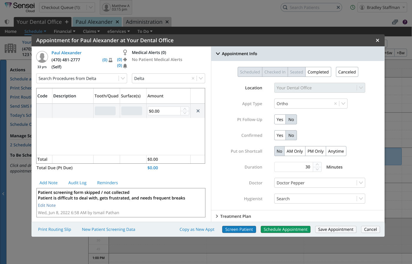
Below is the Appointment modal used to enter and edit appointment details. This is an existing part of the appointment booking flow, I am just showing it for context:
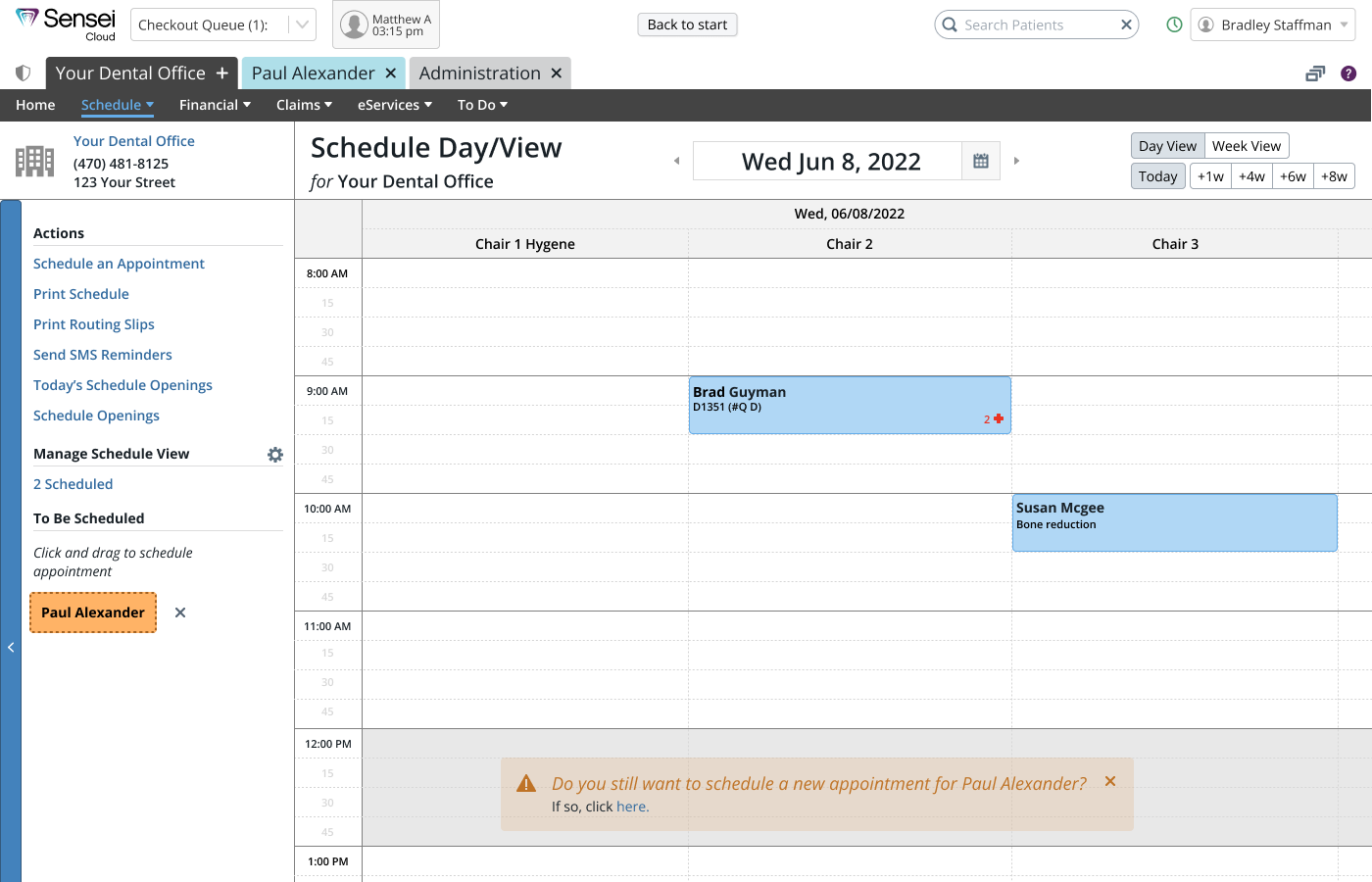
After the appointment details are entered, the appointment can be scheduled. The appointment appears as a small orange card on the left side of the screen. This page is showing an appointment that has been rescheduled during the flow where the user originally selected the action 'Creating New Appointment.' That's why there is a toast at the bottom of the screen, this is to give the user the option to complete their original task of scheduling a new appointment.
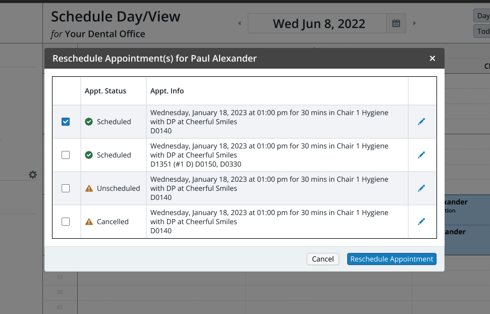
Below is a modal that appears when the user chooses to reschedule a patient's appointment. Take note of the checkboxes in a column within the table, where the relevant appointment is automatically selected. If the user wishes to reschedule multiple appointments simultaneously, they can also select other appointments using the checkboxes.
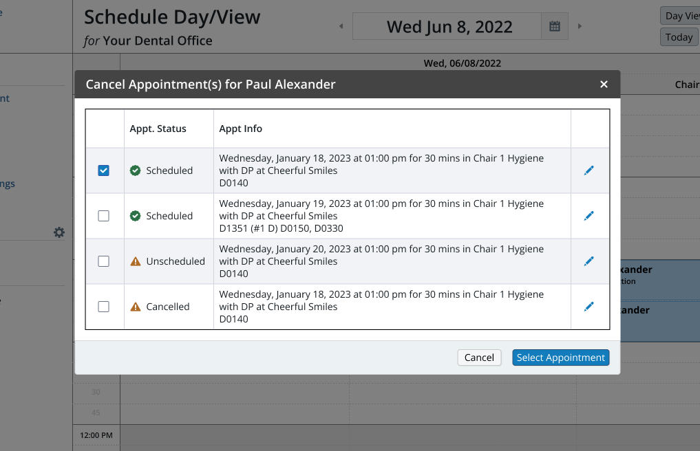
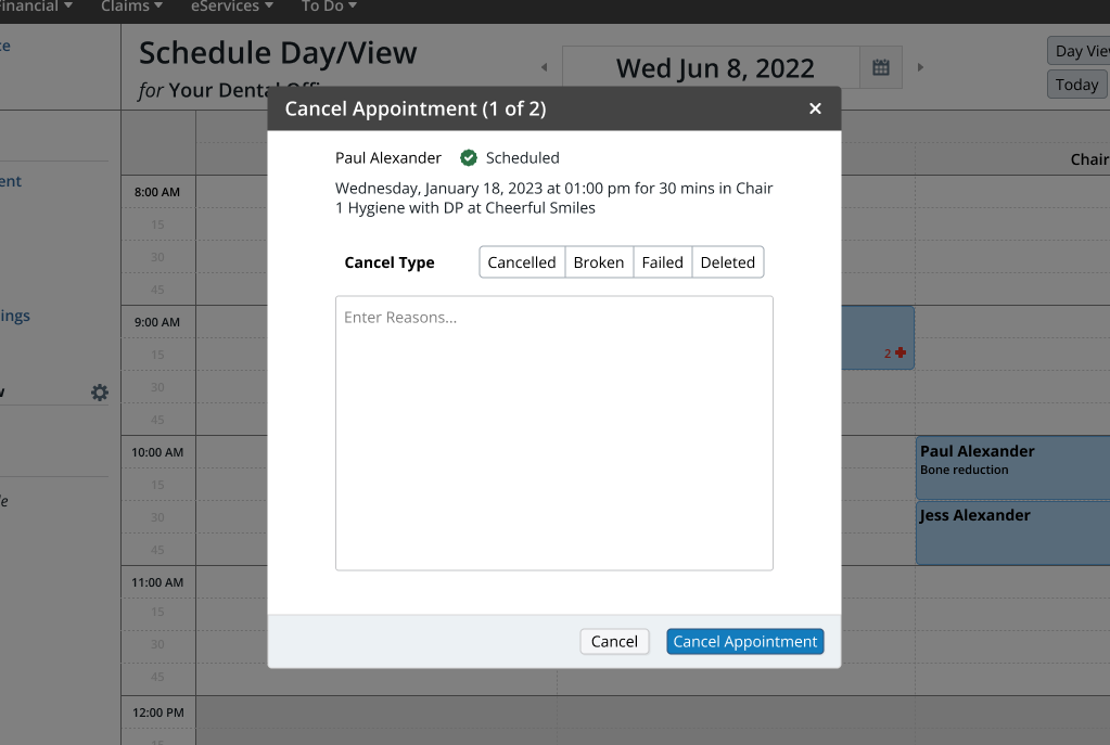
Below, you'll find the modals used when a user decides to cancel an appointment. Similar to the process of rescheduling, the user can select the corresponding appointment and use checkboxes to cancel multiple appointments simultaneously. Once appointments are canceled, the user is directed to a confirmation dialogue that prompts them to provide a cancellation reason. If more than one appointment is canceled simultaneously, the user will go through all the required confirmation dialogues.
Testing solution #1
Now that we had a functional prototype, we wanted to conduct usability tests to evaluate the effectiveness of the appointment alerts feature. The purpose was to gather user feedback and insights to inform further improvements. Here is what we wanted to learn:
- Can users complete these flows?
- Is this a valuable solution to the user's problem?
- How do users expect to customize this feature?
- Do users want a toast reminder if they don’t complete the flow?
After creating a research plan and testing script, I led user feedback sessions and usability testing with 5 users.
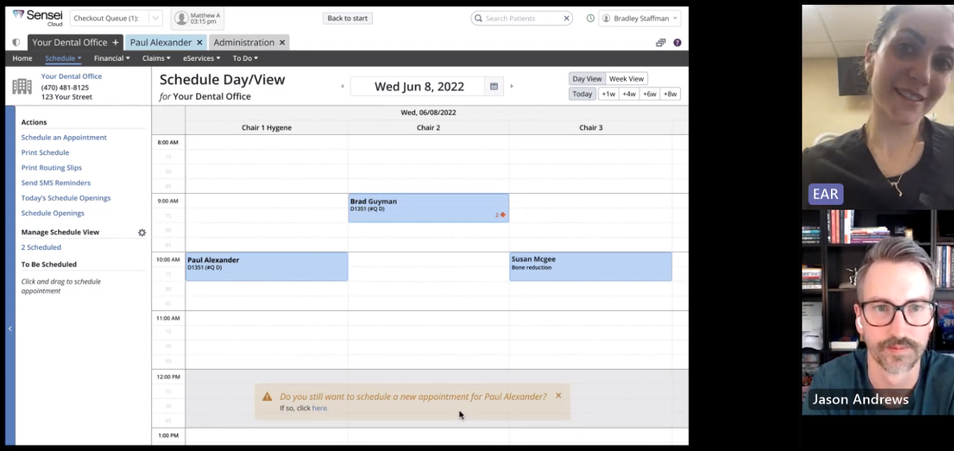
Here are the results from our tests:
- 100% were able to successfully complete the flow of booking, rescheduling, editing, and canceling appointments.
- 100% recognized the value of the proposed solution.
- 100% expected the settings to be under ‘Notifications’ with a choice to turn on and off scheduled appointments and pending appointments separately.
- 80% wanted more quick actions: reschedule, cancel, and delete.
- 60% prefered to have the toast warning when scheduling gets off track.
- 60% expected to see procedure codes on the cancellation dialogues.
Iteration
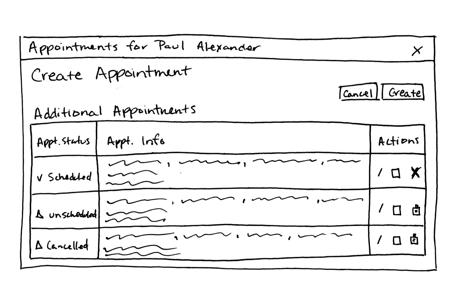
Participants successfully navigated through the flows and appreciated the convenience of viewing a patient's additional appointments while booking. However, many expressed a desire for more functionality within the dialogue. They anticipated features such as the option to delete previously canceled appointments and schedule unscheduled ones. Implementing these additions would necessitate creating five distinct modals for each user action. To better grasp the concepts, I took the initiative to sketch out these ideas:
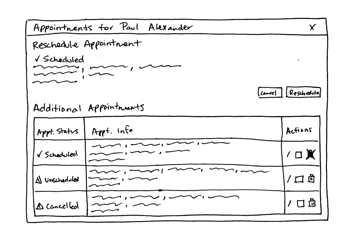
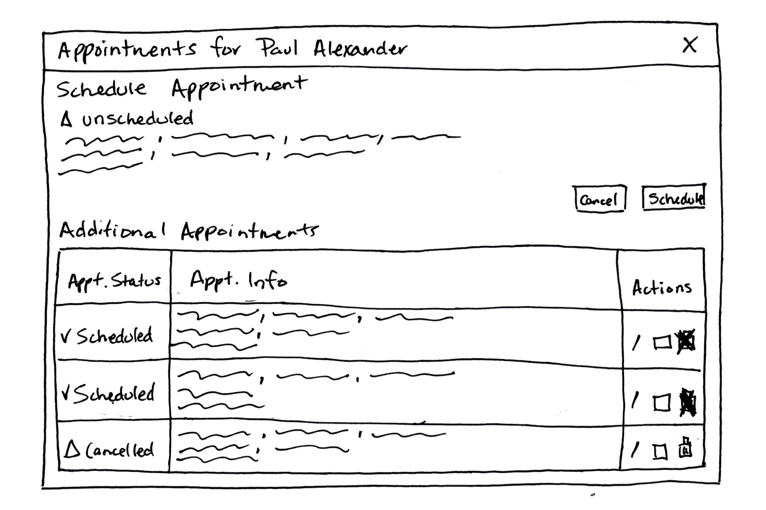
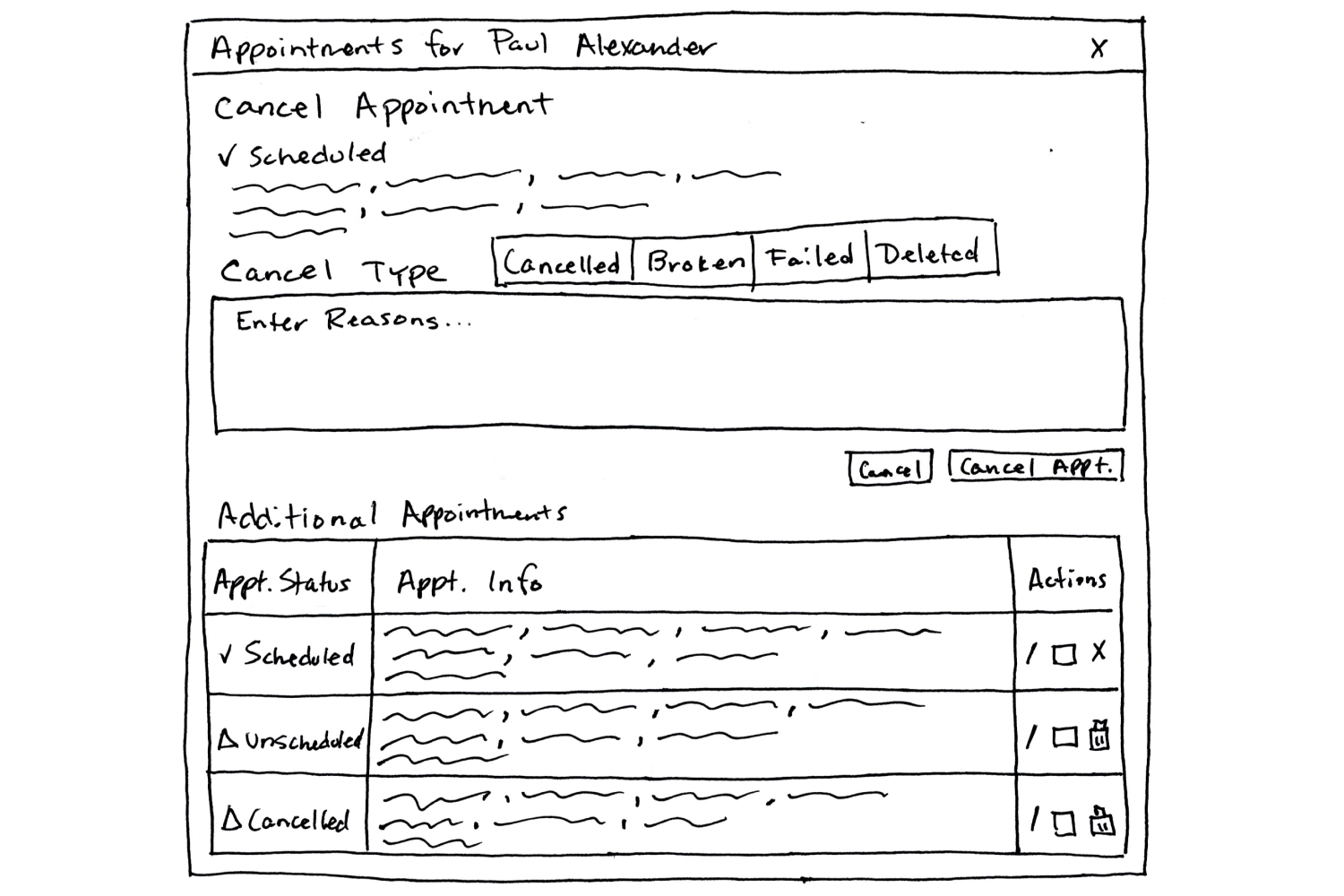
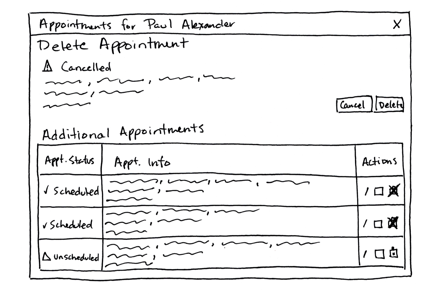
Following the creation of these sketches, I sought input from my manager, product owner, and lead developer. Subsequently, I developed high-fidelity mockups for these windows:
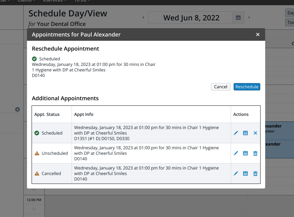
Initially, everything appeared feasible, but the more I explored this solution, the more it struck me as excessively intricate. Introducing a new modal into the user flows and incorporating a toast notification when users didn't complete the original process started to feel unnecessarily complex. Considering the development resources needed for creating five new windows, along with the additional toast notification for incomplete flows, and the extra clicks required from users, it no longer seemed like a worthwhile solution.
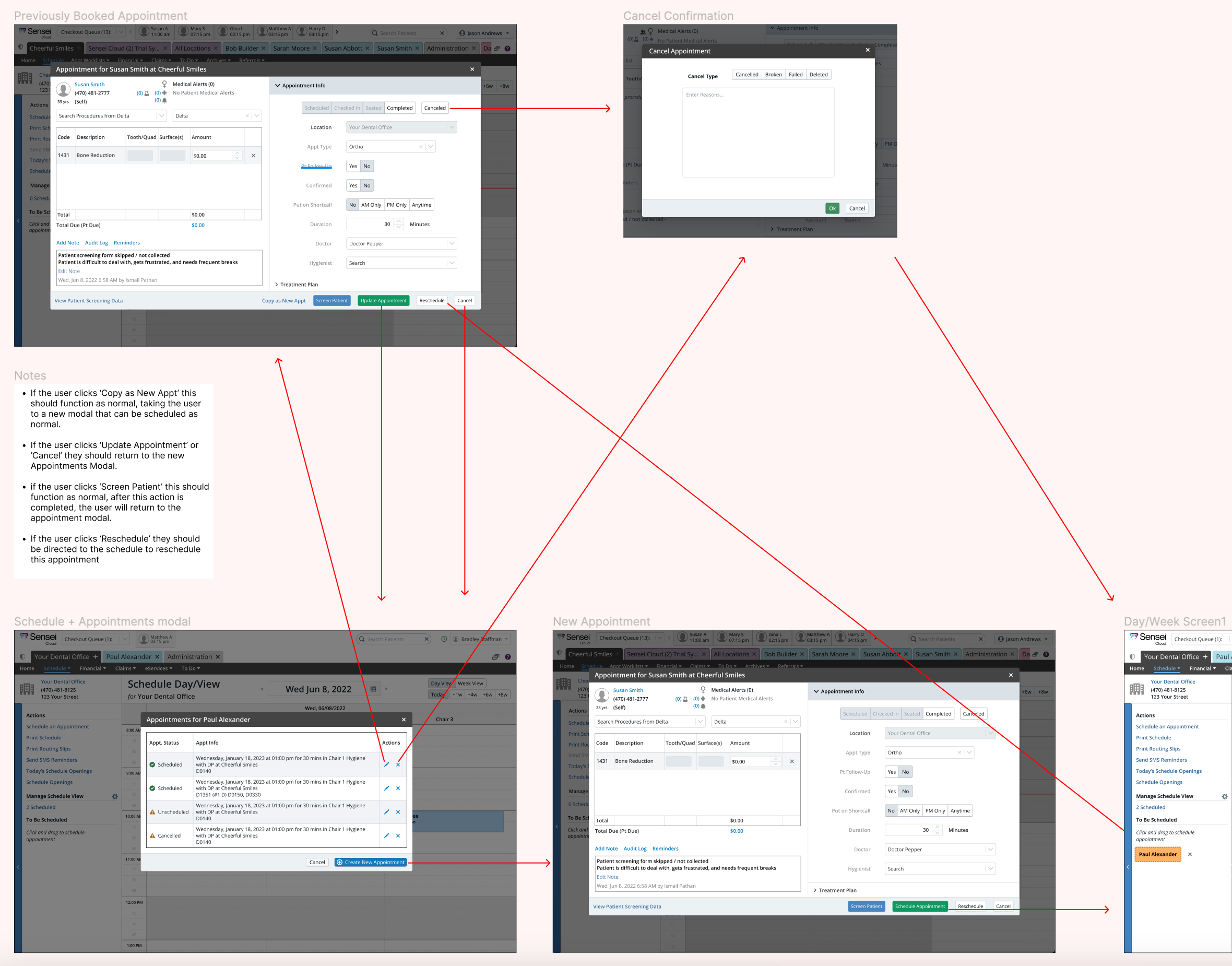
After careful consideration, I concluded that the optimal solution was to create a dedicated scheduling page for each patient. This page would feature a comprehensive list of all appointments and provide a functional area where users could easily view and edit the specific appointment they were focusing on. While presenting this idea to my product team, I encountered resistance to a complete redesign of the booking system. As a compromise, I suggested adding an All Appointments section to the existing Appointment window. This section would showcase all the desired functionalities requested by our users, thereby eliminating the necessity to develop new windows and simplifying the solution’s user flow and development efforts.
Pivoting to a new solution
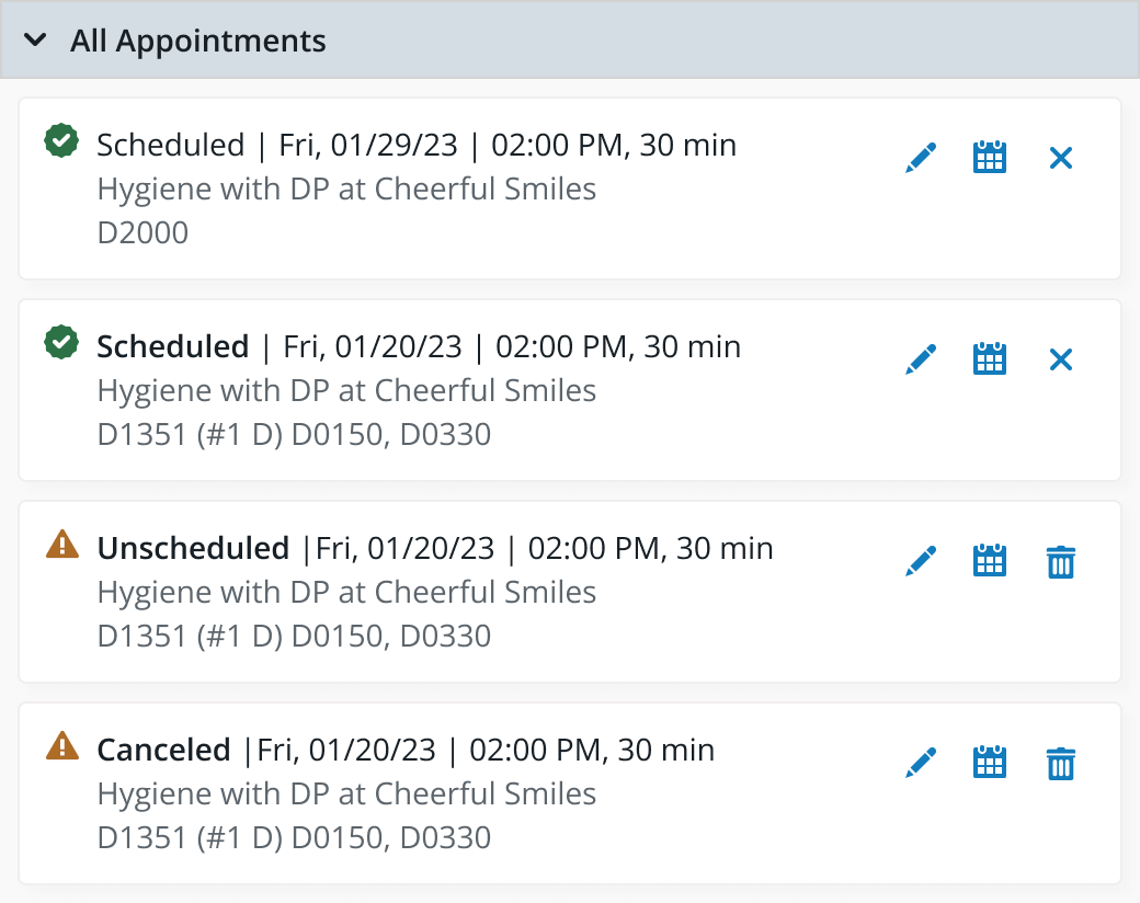
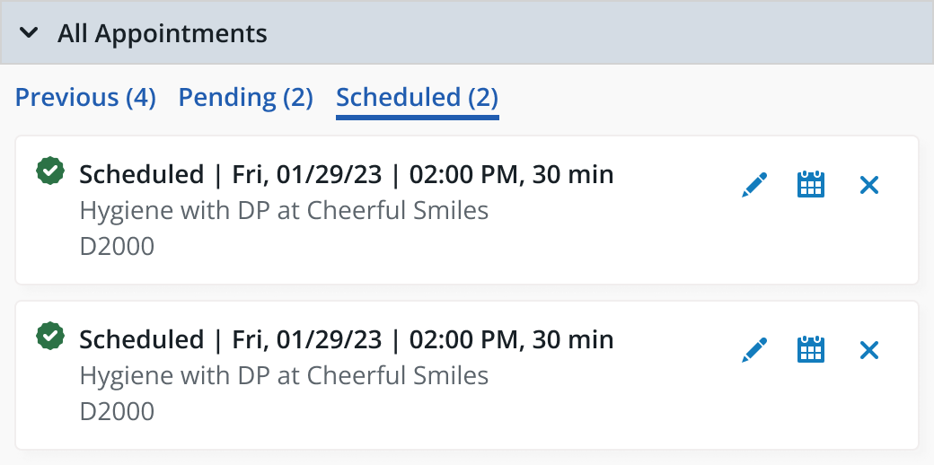
Adding an All Appointments section to the Appointment modal was an easy task. The existing window provided a solid foundation, and I simply augmented it by introducing a new section on the right-hand side within the accordion. This new section features cards containing all the essential appointment details from the previous design, now equipped with the actions users had been requesting. To showcase and validate this enhanced functionality, I developed a prototype for demonstration and testing purposes.
Testing solution #2
I tested the appointment alerts feature with 7 users to assess its effectiveness. The goal was to collect user feedback and insights, which will be used to validate the design and make informed enhancements before moving forward with the development phase.
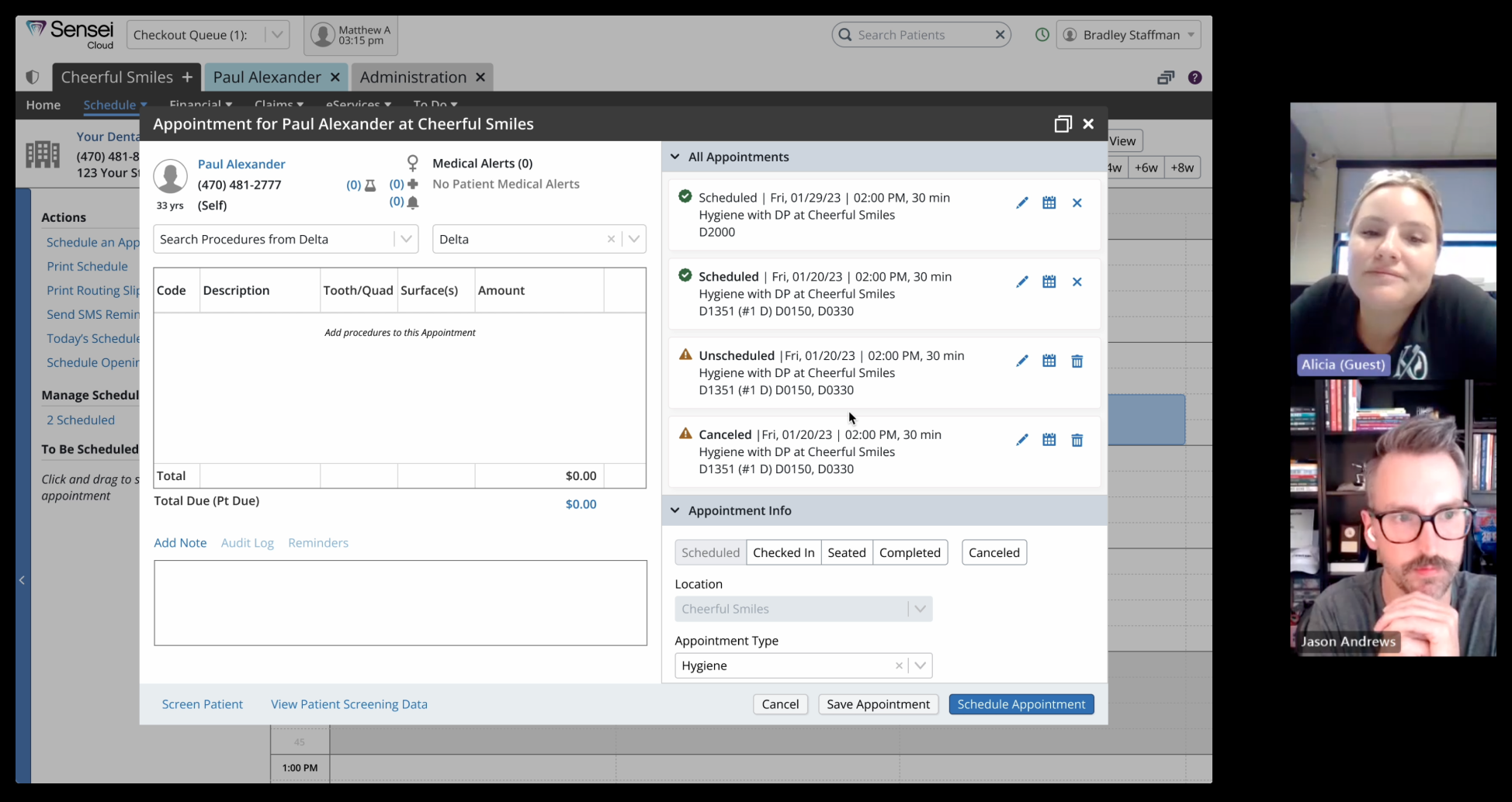
Here is what we wanted to learn:
- Do users find the All Appointments section helpful when editing, scheduling, rescheduling, canceling, and deleting an appointment?
- Do users expect this to work the way that it does?
- What content do users expect to see in the appointment cards?
- Do users prefer to see tabs for scheduled and pending appointments?
- Do users want the All Appointments window open by default?
The accordion section contains all of a patient’s appointments, but it can be split into scheduled and pending, allowing the user to sort this way could be valuable. I conducted A/B testing to determine which way users prefer this to be displayed:
Testing Results:
- 100% were able to successfully complete the flow of scheduling, rescheduling, editing, canceling, and deleting appointments.
- 100% want to have an All Appointments section in the Appointment modal.
- 100% were satisfied with the content on the Appointment cards.
- 71% prefer tabs instead of a master list.
- 58% prefer the All Appointments window to be open by default.
Conclusion
The addition of the All Appointments section to the Appointment modal has been a resounding success! Users unanimously expressed a desire for this feature, and it promises to be a quick win for the business. This solution is significantly more efficient than the initial concept, where users had to navigate through an interstitial page to access other appointments.
To optimize user experience, we are implementing straightforward settings for the All Appointments section within the Appointment modal. Users will have the option to easily toggle this section on or off, as well as choose whether it should be initially opened or collapsed. Additionally, users can customize which appointment types are available for toggling through the tabs.
This feature is currently in production and is anticipated to deliver benefits for both users and the business.
