UX Design Case Study
Feature improvement project for dental practice management software from the winter of 2022. I was the UX designer on a cross-functional team that completed this over the course of 8 weeks.

The problem
Each patient has a separate ledger, so users spend too much time and energy billing families using the software
The goal
To reduce friction for users when viewing and printing connected balances, and to create an easy way to print a family statement
The user
Someone who works in the front office for a dentist, orthodontist, or oral surgeon. Typically the office manager, or some type of patient-facing front desk worker.
The solution
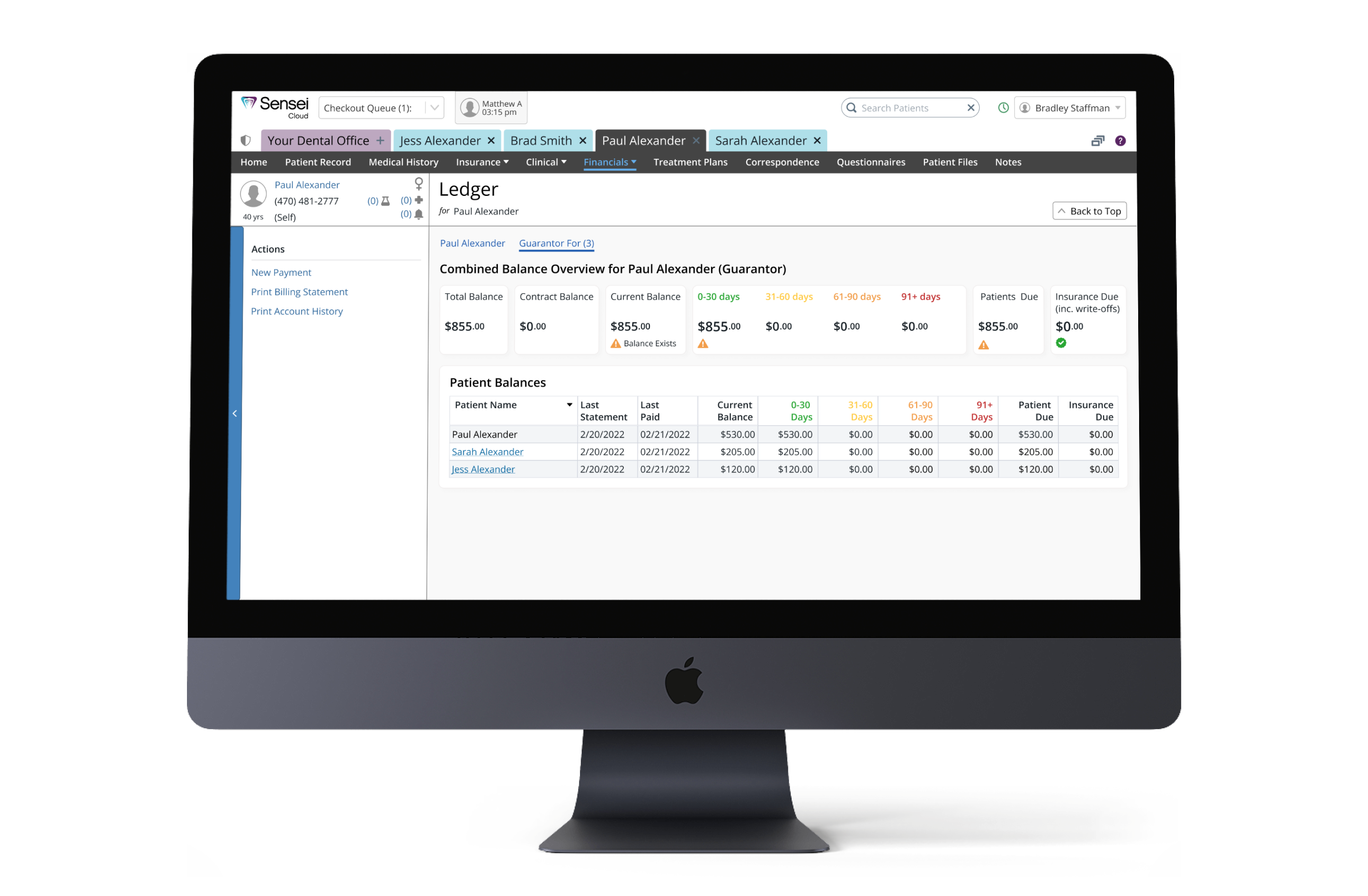
Tab-based options on a patient’s ledger allowing them to view and print individual, or combined balances for guarantors along with a new group statement printout option
Research
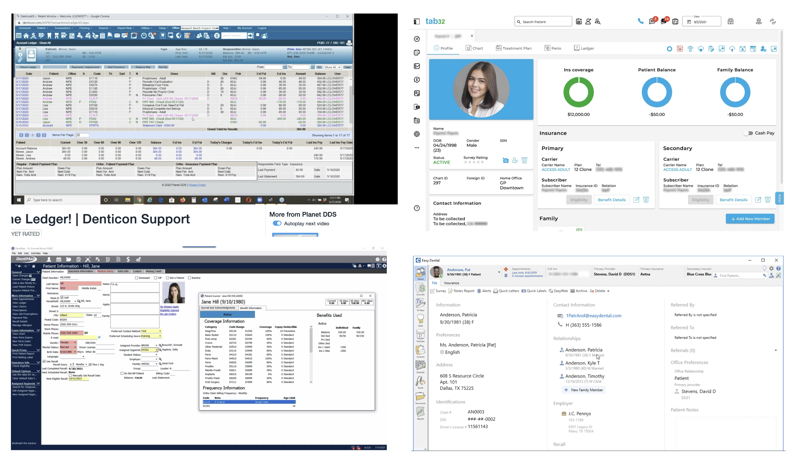
The business prioritized ‘family billing’ because of customer requests on UserVoice, our customer feedback portal. This project was originally assigned to another designer at the company who conducted the initial research. This involved 6 customer interviews to uncover the general pain points and competitive analysis of 4 dental practice management software competitors that have a similar feature.
Quote
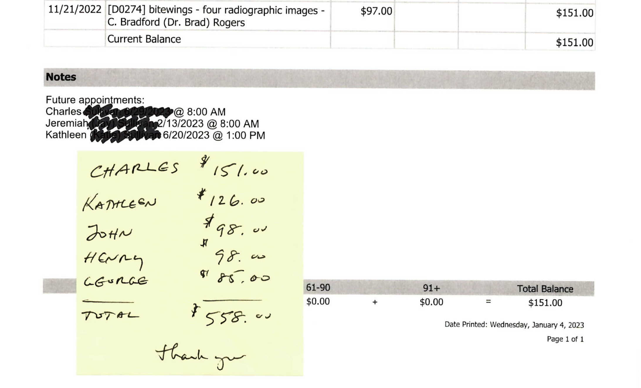
“It's time-consuming and expensive to print out all these bills and add up the totals, but more importantly, it makes our practice look unprofessional and a little foolish. Patients have commented about our waste of paper.” - Sarah, user
This is a screenshot of the original ledger design. It only allowed for invoices to be printed one at a time:
.png)
Users were spending a lot of unnecessary time when billing a family because they had to print out individual bills for each patient and then add that total up. I also noticed a theme of friction when managing patient connections.
Pinpointing the problem
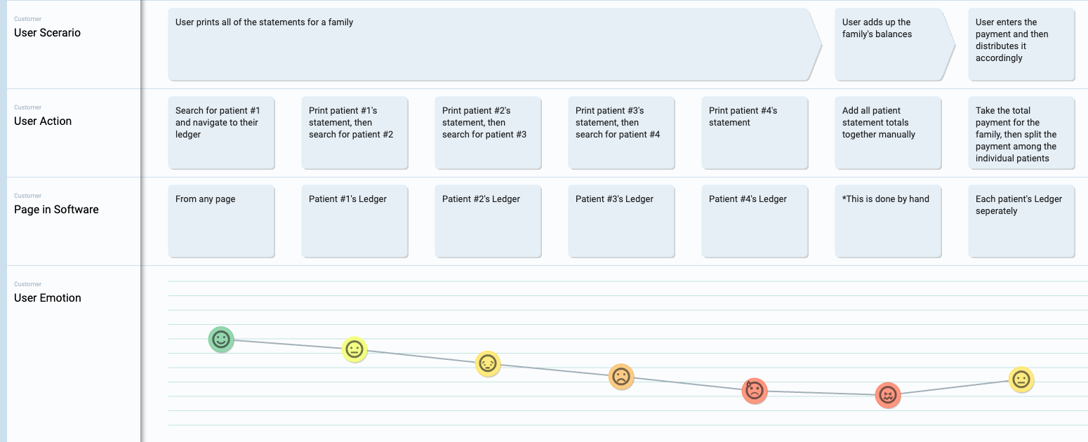
As users navigated through the process of searching for each patient and printing their statements individually, their overall sentiment towards the experience significantly declined. The task proved to be quite draining. To visually depict this challenging user experience, I created a user journey map.
The customer interviews and competitive research informed our product line manager enough to create some brief requirements for this epic. The output was this user story map that served as a roadmap for developing these features.
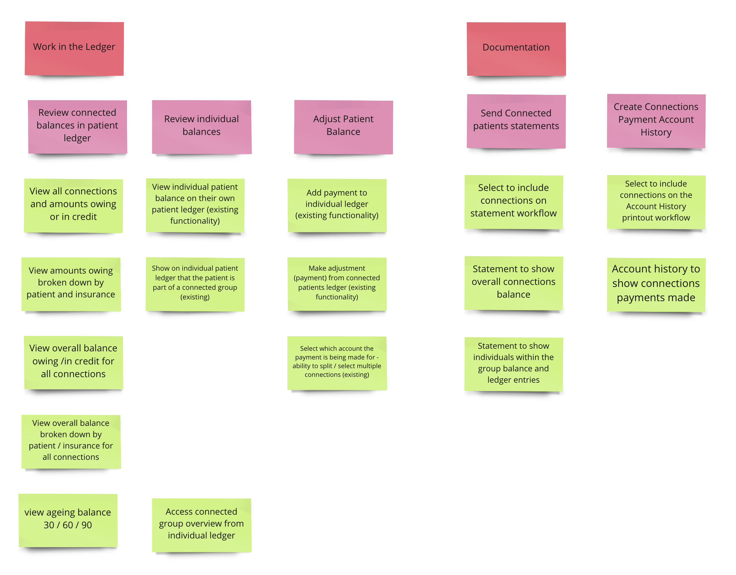
Once the original designer got to the ideation phase, she could not get buy-in for her solution because it involved too much change. I was asked by the UX manager to come in and pair with her to help make progress, this involved us taking a step back. After I was up-to-speed, and was able to create alignment with the team and stakeholders, the original designer was let go and I was asked to be the lead designer on the project.
Struggling to find a solution
Unlike typical dental management systems that group patients under one account with a single guarantor, our system treats each patient separately. This means each patient must identify their own guarantor, creating a network of connections rather than groups.
These connections, set up by users, can be complex, but offer flexibility to non-traditional families. After brainstorming with my team, we decided to redesign the ledger adding tabs showing different groups based on the guarantor. I sketched these ideas to discuss with my team.

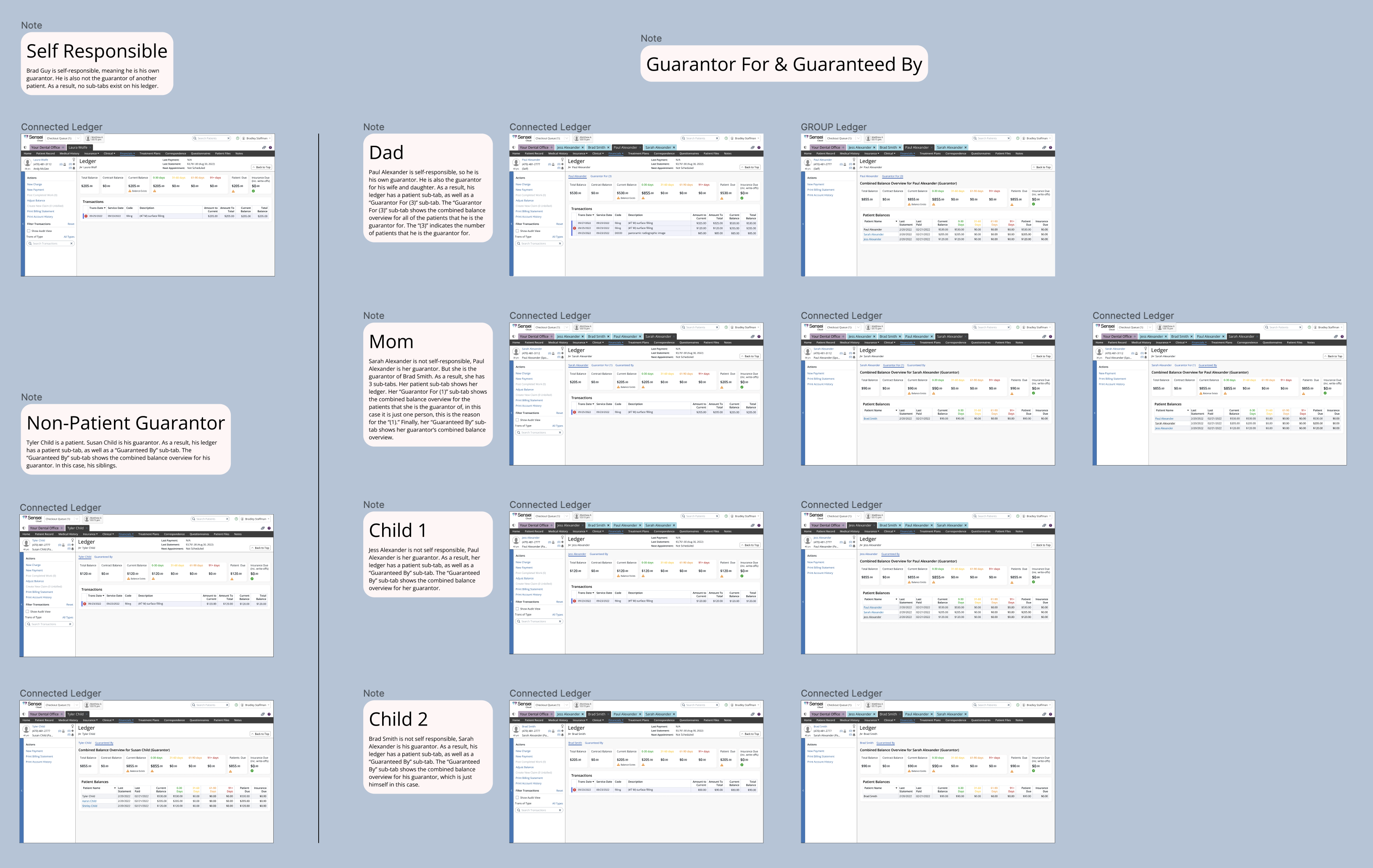
A patient in the system could have a guarantor, but also be a guarantor. This is a person who is not financially self-responsible, but they are responsible for another person. This is an edge case, but we wanted to keep this existing functionality for our users, here is how the 3 tabs would be organized:
- (Patient Name) Shows the patient’s individual ledger.
- (Guarantor For) Shows this patient’s combined guarantor ledger.
- (Guaranteed By) Shows the combined ledger for this patient’s guarantor.
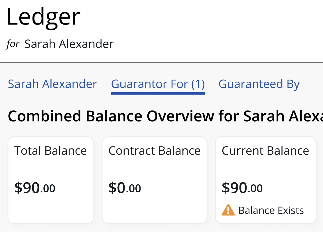
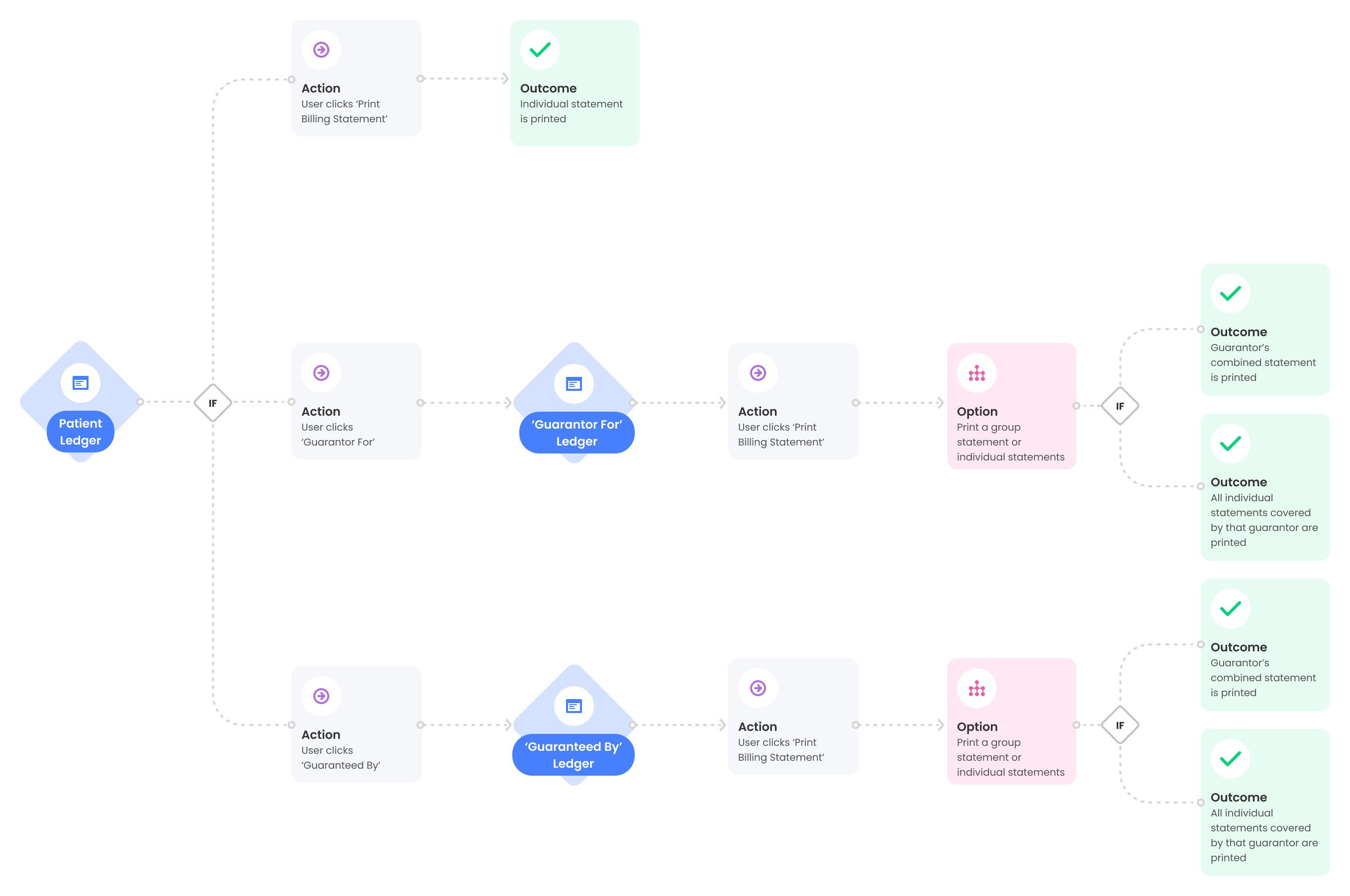
We wanted to give the user the option to print guarantor statements in 2 ways, either as a combined statement, or as individual statements. This would give the most complicated patient’s 5 print options. Here are the user flows:
We all agreed that we should move forward in this direction. Using Figma, I created mockups of every variation that could exist in the system by creating a complex family example.
Building a prototyping
I built an interactive prototype using Figma that allowed users to view guarantor and individual ledgers and print their statements.
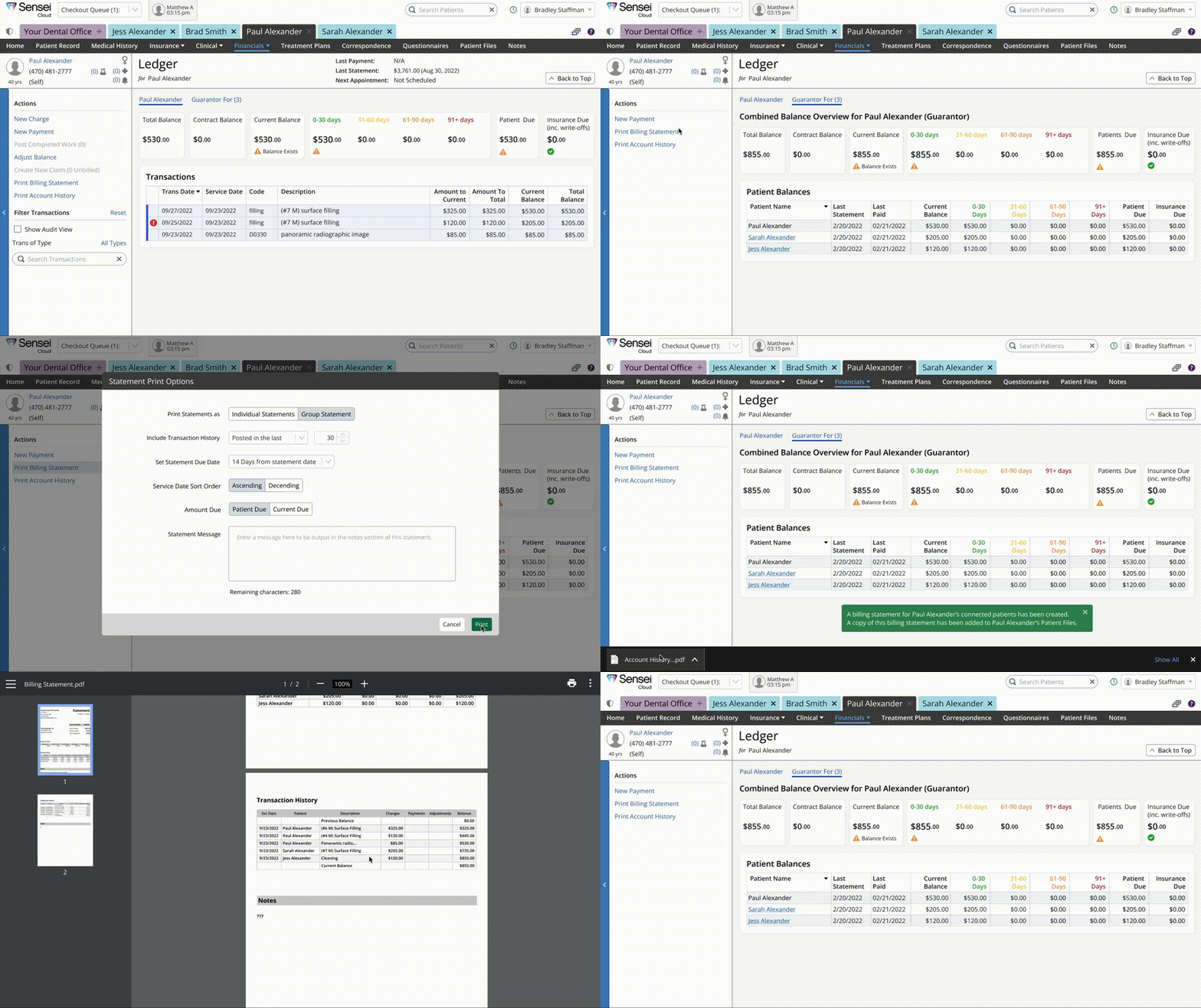
In the process I also gave the ledger a bit of a facelift by wrapping the sections in cards, which aligned with our new design standards.
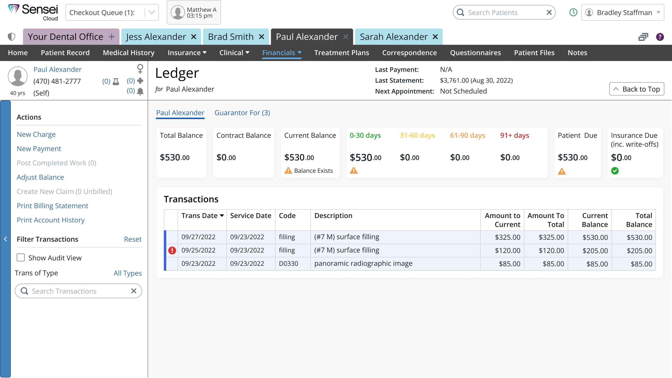
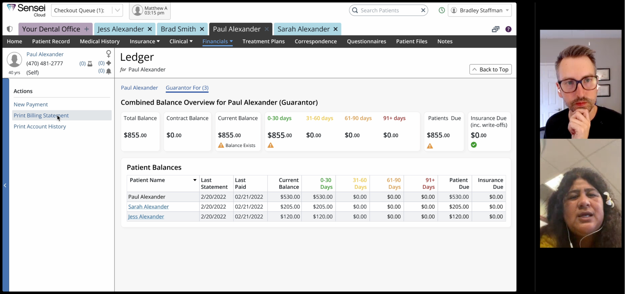
The new guarantor ledger design shows combined balance totals as well as individual totals.
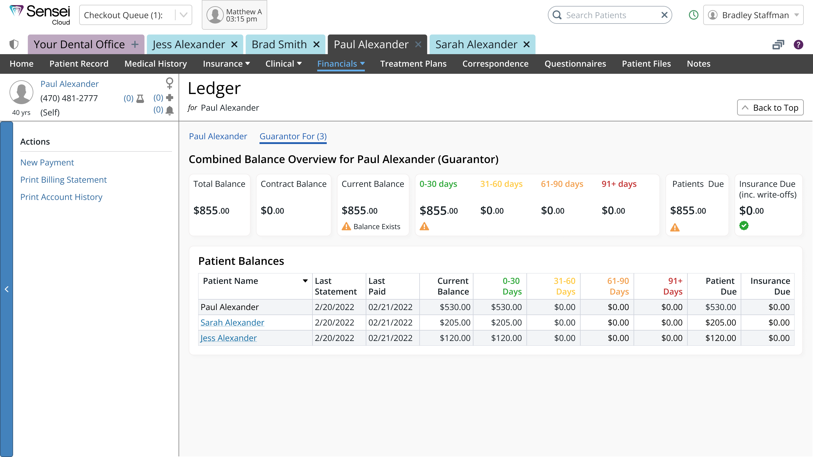
This design allows the user to select printing options for each. For example, when printing a combined ledger, the user can select to print a group statement, or individual statements for all of the associated patients.
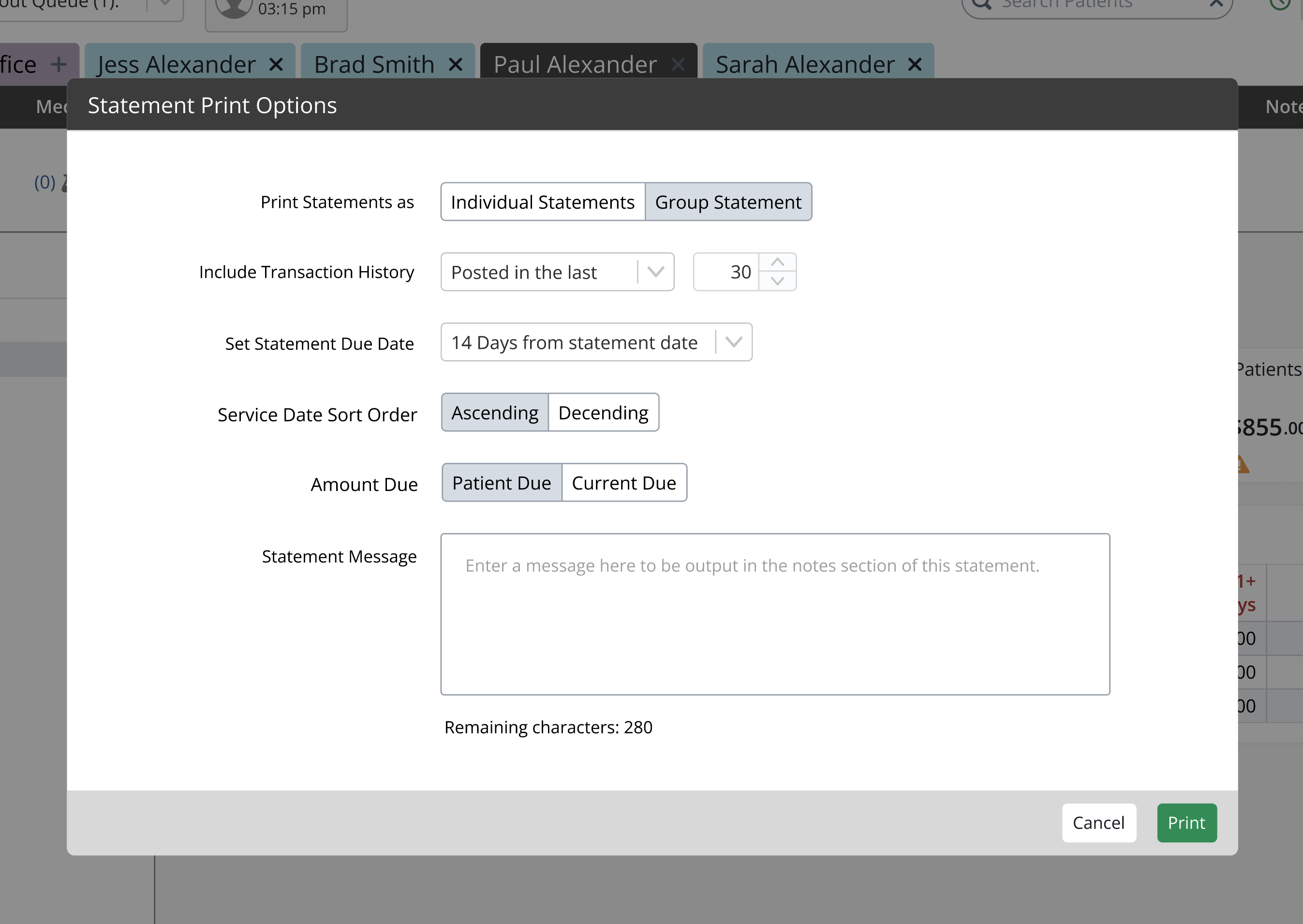
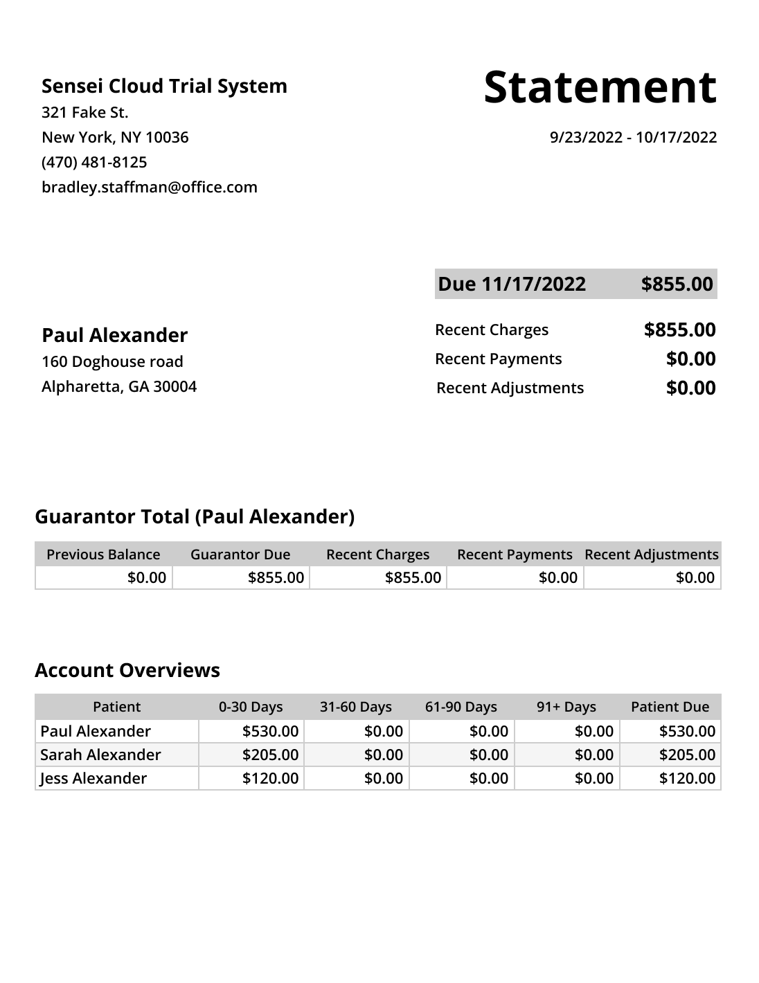
Here is the guarantor statement:

Testing the idea
I led usability testing sessions with 4 users.
What we wanted to learn:
- Do users understand the concept of viewing a ledger as patient and as guarantor?
- Can users complete this new flow? How long will it take them?
- Do group ledgers have the information and layout expected?
- Do users expect to see individual ledger views on the group ledger? Not just patient overviews. Where?
- What do users think of the redesign of the ledger?
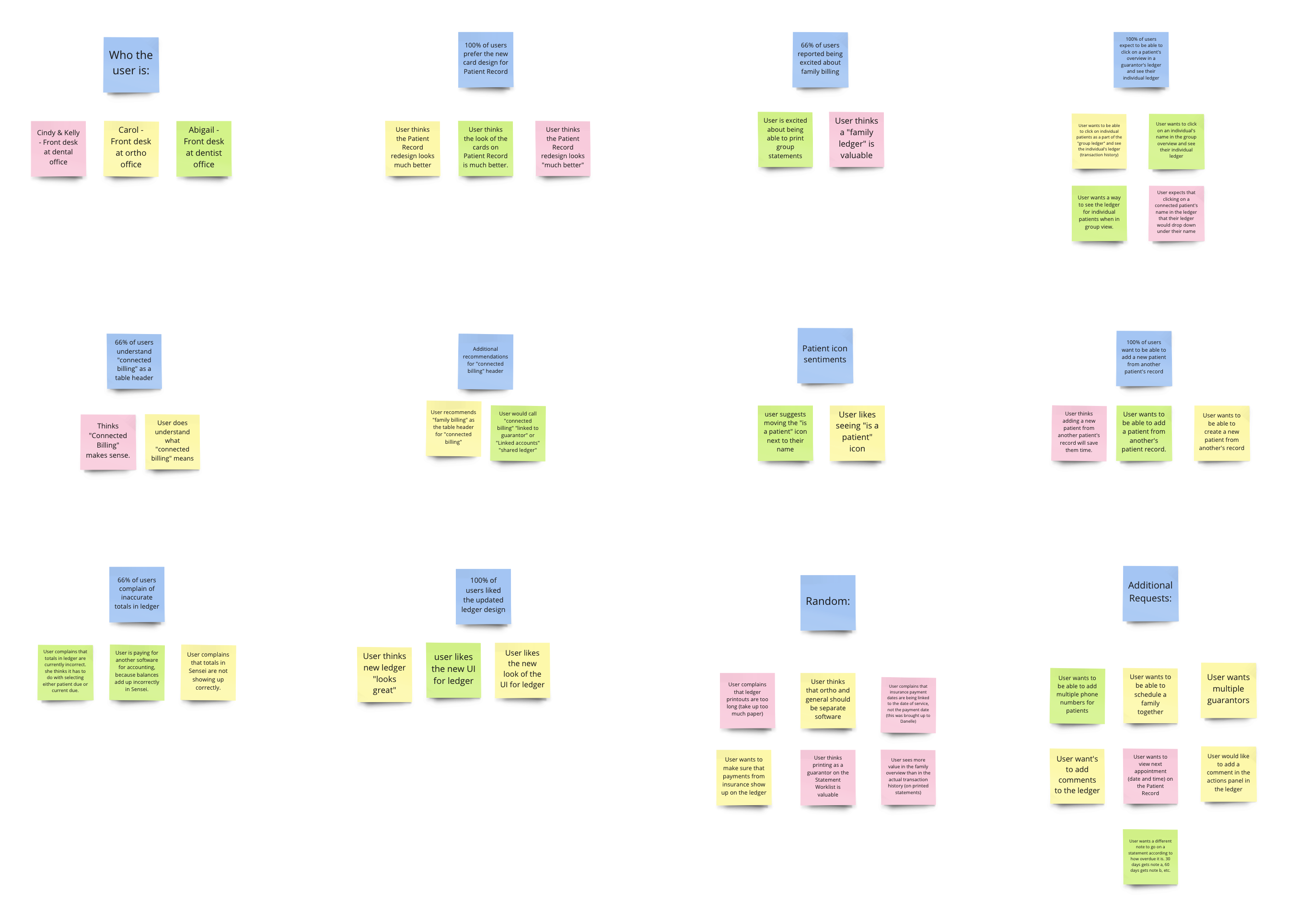
Here is a screenshot of the affinity diagram where I synthesized the testing feedback with my product owner and lead developer:
Key Takeaways From User Feedback:
- 100% understand the idea of patient vs. guarantor ledger view.
- 100% are able to complete the task of printing a guarantor statement with the average time of 27 seconds.
- 100% prefer the updated ledger design.
- 100% expect to be able to click on a patient's overview in a guarantor's ledger and see their individual ledger.
Conclusion
I presented the prototype and research findings to the product team and we decided to move forward with this guarantor billing solution to solve the family billing problem. Because the guarantor connections already exist in our user’s systems, we can deliver value quickly this way. I worked with my core cross-functional development team to deliver this code, and it has been in use by our customers for a few months. We have recieved rave reviews on how flexible and time-saving this solution is.
On average this new family billing process saves our user 32 clicks, 9 keystrokes, and 1 minute and 52 seconds per family. Collectively, this new feature will save our customers millions in labor costs over the coming years.
